Designing a Personal Site
When I first started working on this site, I found the first steps of the process very difficult. How do you reduce yourself into a few words and a layout? How do you express who you are without being self-centered?
Luckily, there are a lot of established design processes for these types of problems. The first is defining use cases. Simply put, how do I want my site to be used?
I was mainly focused on a few cases:
- visitors can find links to my projects/media
- visitors can see my face (somewhere)
- visitors can read about my ideas
With these priorities in mind, I started thinking about what I want my first impression to be, and ended up with this:
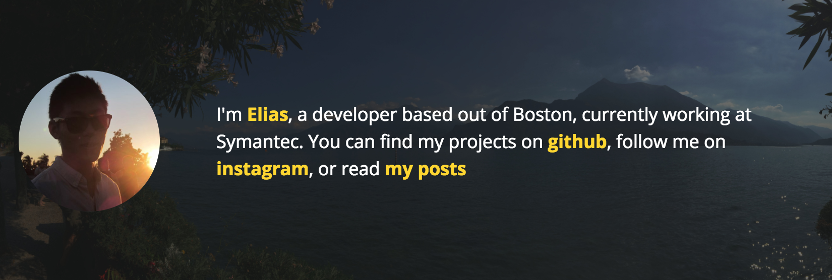
This came from a variety of motivations. First, I wanted to have a picture of my face, in order to keep things personal:

This one is from a long time ago (don’t judge), but I really like the colors in it.
To explain a bit about who I am, I added the little blurb, which conveniently links to a lot of ME things (like my github and instagram):
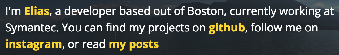
it also has a link to my posts, which are just posted below it on the home page. I chose to make it a blog because it would allow the site to evolve as I learn/consume new things (okay, also because I wanted to blog).
The background is a picture I took on a trip in Italy that I tinted down to make the blurb easier to read. There’s a trend in visual design centered around using more large images, and its valuable to share a visual language with your peers, in order to stay current.
All together, it looks like this:
That covers the first two things: having links to my projects, and a picture of my face.
Great! Now for expressing my ideas in blog form. What are the use cases here?
- visitors can find the posts on google
- visitors can browse a list of posts
Because I plan to write about a variety of topics,
- visitors can browse a list of posts with a certain topic
And because of my goal of expanding my online presence
- visitors can subscribe to my blog
I’ll write more about SEO and building a blog with jekyll in a later post, and for now, we’ll focus on design. Let’s start with the list of posts:
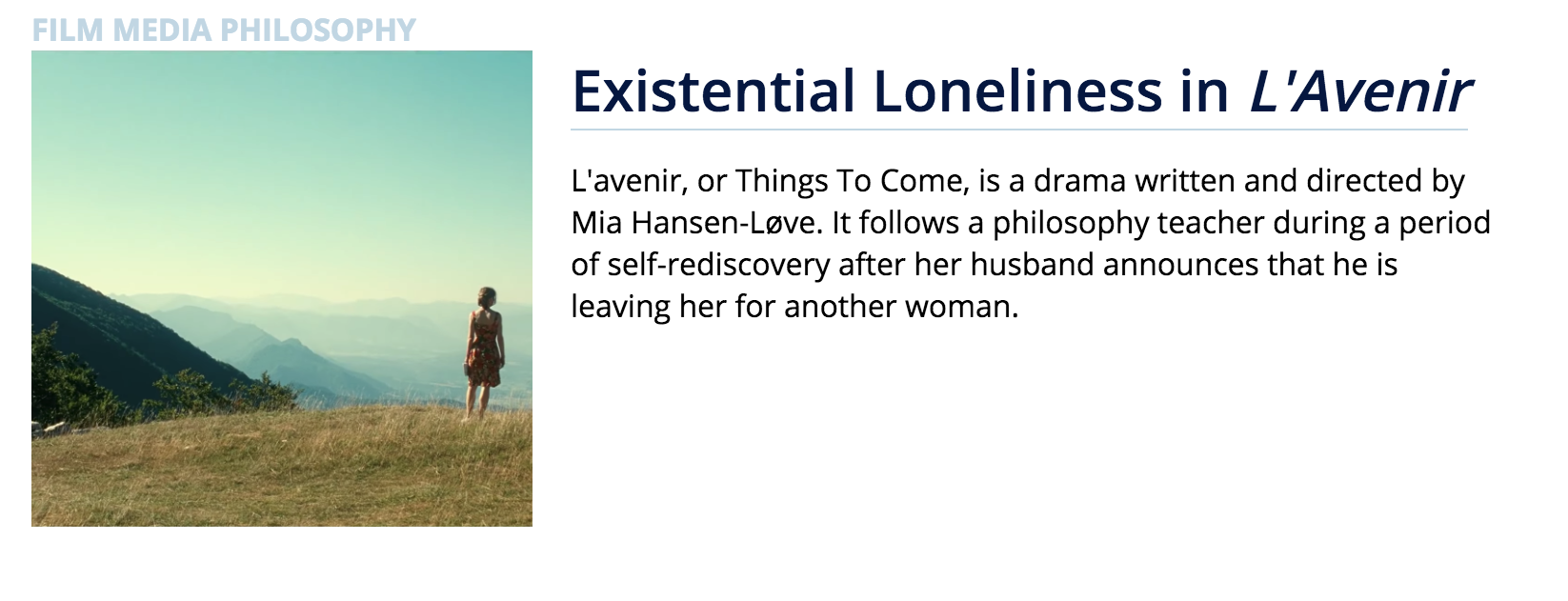
I decided to have the list of posts on the home page, so that visitors can get straight to the content.
Each post has an image (for visual engagement), and a title/description to show the content. I also added tags so that the user can navigate to similar posts.
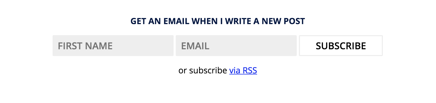
I also added a subscription widget at the bottom of every page, so that I can grow a base of readers. I’m using mailchimp to manage the subscription, which I’ll cover in a later post.
And altogether, I have a personal site that includes a blog and covers the following use cases:
- visitors can find links to my projects/media
- visitors can see my face (somewhere)
- visitors can read about my ideas
- visitors can browse a list of posts
- visitors can browse a list of posts with a certain topic
- visitors can subscribe to my blog